
Sponsor Millionaire’s Brain Academy
Table of Contents
What is Color Theory?
Color is all around us, influencing our emotions, perceptions, and even our behavior. Whether you’re a designer, photographer, marketer, or simply someone interested in the world of colors, understanding color theory is essential. In this ultimate guide, we will delve into the fascinating world of color theory, exploring its basics, applications, and the powerful impact it can have on various creative disciplines.
The Basics of Color Theory
Before we can dive deeper into color theory, it’s important to grasp some fundamental concepts. Colors can be classified into three primary categories: primary, secondary, and tertiary. Primary colors are the building blocks of all other colors and cannot be created by mixing other colors. They include red, blue, and yellow. Secondary colors, on the other hand, are created by mixing two primary colors. Orange, green, and purple fall into this category. Lastly, tertiary colors are formed by combining primary and secondary colors.
Colors also have different properties, such as hue, saturation, and brightness. Hue refers to the actual color itself, while saturation determines the intensity or purity of a color. Brightness, also known as value, represents the lightness or darkness of a color.
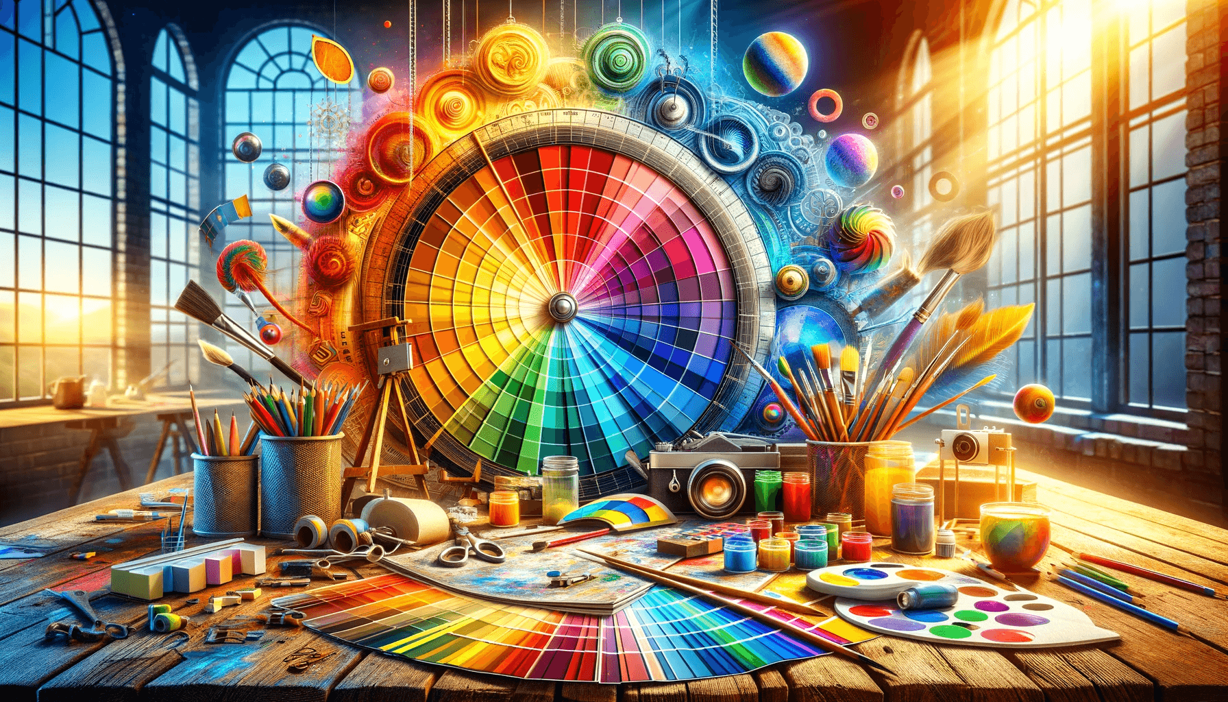
Understanding the Color Wheel
To gain a comprehensive understanding of color theory, it’s crucial to familiarize yourself with the color wheel. The color wheel is a visual representation of the relationships between different colors. It consists of primary, secondary, and tertiary colors arranged in a circular format.

The color wheel is divided into two main sections: warm colors and cool colors. Warm colors like red, orange, and yellow evoke energy, warmth, and excitement. Cool colors, including blue, green, and purple, elicit a sense of calm, tranquility, and relaxation.
Primary, Secondary, and Tertiary Colors
As mentioned earlier, primary colors are the foundation of all other colors. When primary colors are mixed, they create secondary colors. For example, combining red and blue results in purple. As the name suggests, Tertiary colors are formed by mixing primary and secondary colors. This process creates various colors, allowing for endless possibilities and combinations.
Understanding the relationships between primary, secondary, and tertiary colors is essential in creating harmonious color schemes in various creative endeavors. You can effectively communicate emotions, convey messages, and create visually appealing designs by mastering these relationships.
Color Harmony and Color Schemes
Color harmony refers to the pleasing arrangement of colors in a design or composition. Achieving color harmony involves selecting colors that work well together and evoke a desired mood or atmosphere. Color schemes play a vital role in achieving color harmony.
There are various color schemes to choose from, each with its unique characteristics and effects. Some popular color schemes include monochromatic, analogous, complementary, and triadic. A monochromatic color scheme uses different shades, tints, and tones of a single color. Similar color schemes use colors adjacent to each other on the color wheel. Complementary color schemes combine colors that are opposite to each other on the color wheel, creating a high contrast effect. Triadic color schemes involve using three equally spaced colors on the color wheel.
The Psychology of Colors
Colors profoundly impact our emotions and can influence our perceptions and behaviors. This is known as the psychology of colors. Different colors evoke different emotions and associations. For example, red is often associated with passion, energy, and urgency, while blue is associated with calmness, trust, and reliability.
Understanding the psychological effects of colors can greatly enhance your ability to communicate and connect with your audience. By strategically using colors in your designs, branding, and marketing materials, you can evoke specific emotions and create a desired response from your target audience.
Using Colors in Branding and Marketing
Colors play a crucial role in branding and marketing. They can shape how consumers perceive a brand and influence their purchasing decisions. When choosing colors for your brand, it’s important to consider your target audience, industry, and the emotions or qualities you want to associate with your brand.
For example, many fast-food chains use red in their branding to evoke a sense of urgency and stimulate appetite. On the other hand, luxury brands often incorporate black or gold to convey elegance and sophistication. You can create a strong and impactful brand identity by strategically selecting colors that align with your brand’s values and desired perception.
Applying Color Theory in Design
Color theory is a fundamental aspect of design. It guides the selection and combination of colors in various design projects, including graphic design, web design, and interior design. By applying color theory principles, designers can create visually appealing compositions, effectively communicate messages, and enhance user experience.
When designing, consider the emotions and associations each color evokes. Use color schemes that align with the project’s objectives and desired mood. Create contrast and balance by incorporating both warm and cool colors. Experiment with different color combinations to achieve the desired visual impact. Utilizing color theory in your design process can elevate your work to the next level.
Color Theory in Photography and Filmmaking
Color theory is not limited to design; it also plays a significant role in photography and filmmaking. Colors can enhance storytelling, evoke emotions, and create captivating visuals. Understanding color theory can help photographers and filmmakers effectively use colors to convey their intended messages.
In photography, colors can create a specific mood or atmosphere. For example, warm tones evoke a nostalgic or romantic feel, while cool tones can create a sense of tranquility or mystery. In filmmaking, color grading is often used to enhance a film’s overall look and feel. Different color palettes can be employed to differentiate between different scenes or convey a specific theme.
Tips for Mastering Color Theory
Mastering color theory takes time and practice. Here are some tips to help you on your journey:
- Study and analyze the work of renowned artists, designers, and photographers who effectively use colors in their creations.
- Experiment with different color combinations and observe how they affect the overall composition.
- Keep up with current color trends and industry practices.
- Practice using color theory principles in small projects before applying them to larger-scale endeavors.
- Continuously seek inspiration from various sources, such as nature, art, and everyday life.
- Take advantage of color theory tools, such as color wheels and online resources, to assist you in your creative process.
Resources for Further Learning on Color Theory
If you’re eager to delve deeper into color theory, here are some recommended resources to expand your knowledge:
- Books:
- “Interaction of Color” by Josef Albers
- “The Elements of Color” by Johannes Itten
- “Color Theory: An Essential Guide to Color” by Patti Mollica
- Online Courses:
- “Color Theory for Artists and Designers” on Coursera
- “The Complete Color Harmony: A Professional Color Reference for Designers” on Udemy
- Websites and Blogs:
- Color Matters (www.colormatters.com)
- Smashing Magazine (www.smashingmagazine.com)
- Online tutorials: YouTube and other websites host numerous tutorials that provide practical demonstrations and tips on utilizing color theory in different creative disciplines.
- Workshops and seminars: Look for local or online workshops and seminars conducted by experts in the field of color theory.
These resources provide a wealth of information, exercises, and case studies to deepen your understanding of color theory.
Conclusion
Color theory is a powerful tool that can elevate your creative work. By understanding the basics of color theory, exploring the color wheel, and applying color harmonies and schemes, you can create visually stunning designs, evoke specific emotions, and effectively communicate your messages. Whether you’re a designer, marketer, photographer, or simply someone with a passion for colors, mastering color theory will unlock a world of creative possibilities. So, embrace the power of colors and let your creativity soar!
CTA: Ready to embark on your color theory journey? Start by experimenting with different color combinations in your next design project and see the impact it can make. Remember, practice makes perfect!